

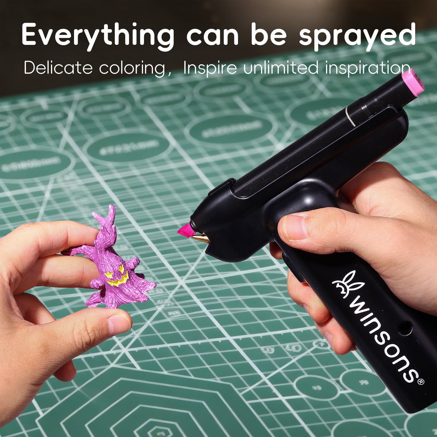


Whether you’re airbrushing lures, models, illustrations, or DIY crafts,
color choice matters even more than technique.
A good color combination instantly makes your work look polished.
The wrong palette can make even a detailed spray job feel messy or unfinished.
This is a simple, beginner-friendly guide to help you pick colors with confidence.
1. Start With the “Three-Color Rule” (works almost for everything)
The easiest, most reliable way to build a color palette is to divide it into:
✔ Main Color (about 60%)
Sets the overall mood and tone.
Great for: cup bases, illustration backgrounds, main model body colors.
✔ Secondary Color (about 30%)
Adds depth, structure and contrast.
Great for: cup patterns, illustration shapes, model armor panels or clothing.
✔ Accent Color (10%)
Used sparingly to highlight important details.
Great for: fine lines on cups, small model parts, illustration highlights, logos, edges.
Examples
l Cup airbrushing:
light blue (main) + light yellow (secondary) + deep yellow (accent)
l Model painting:
pink (main) + red (secondary)
l Illustration background:
deep blue (main) + darker blue (secondary) + black/white (accent)
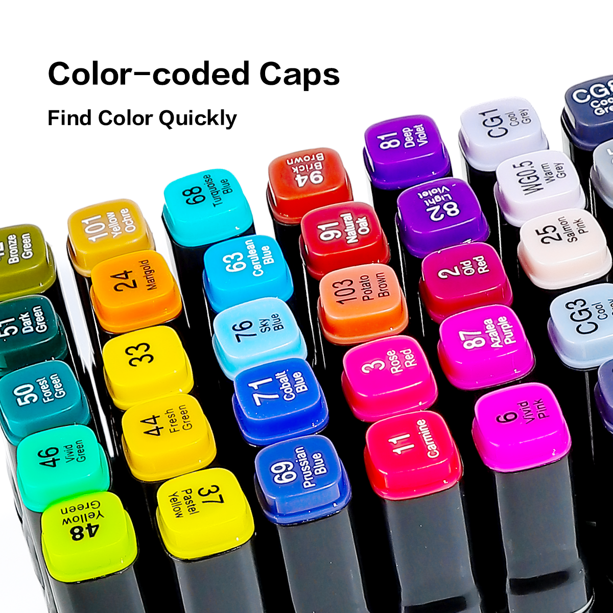
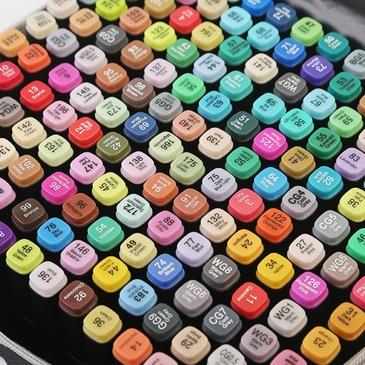
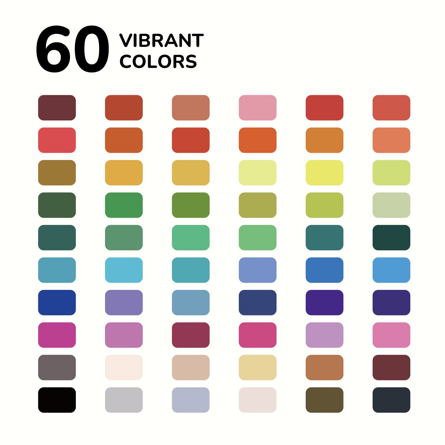
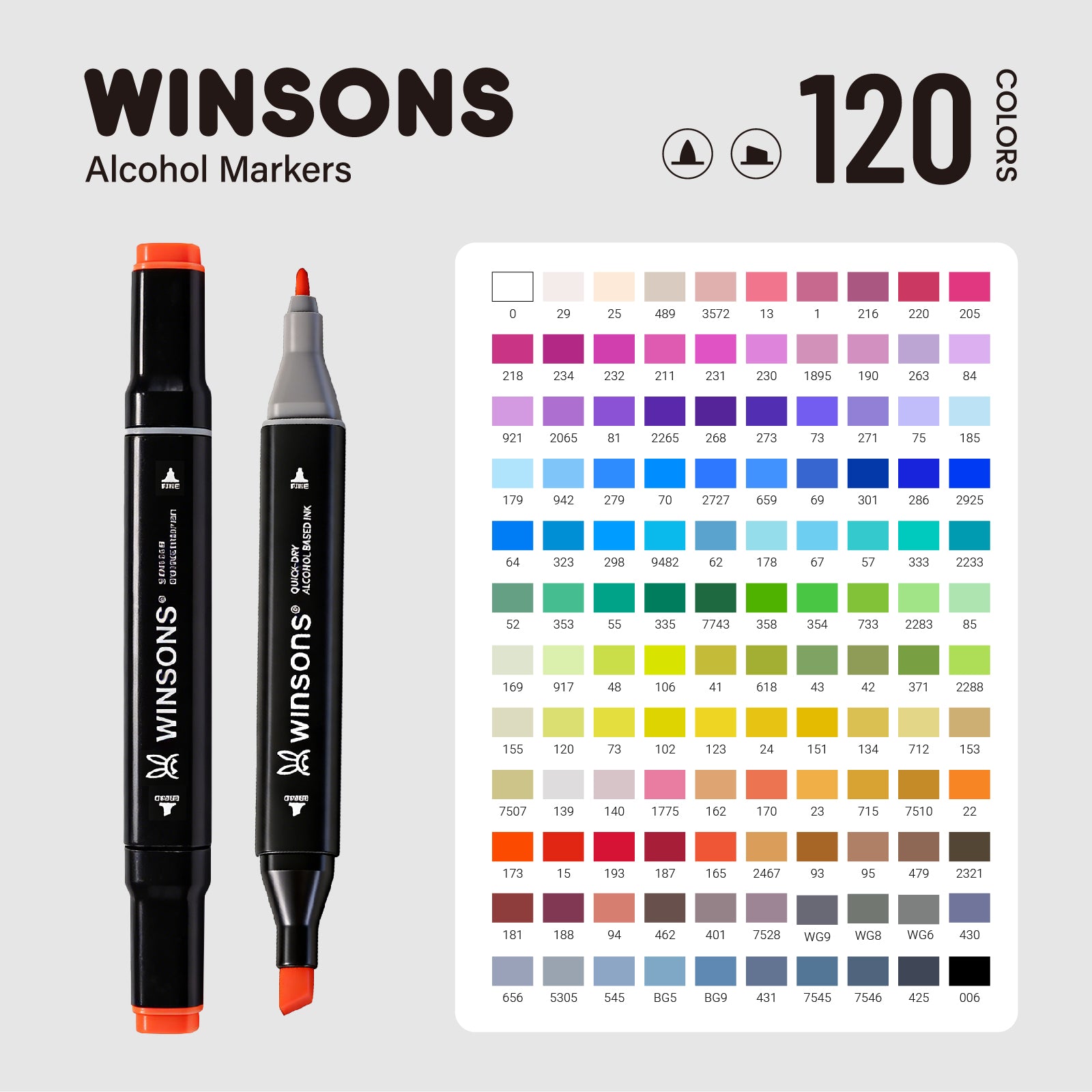
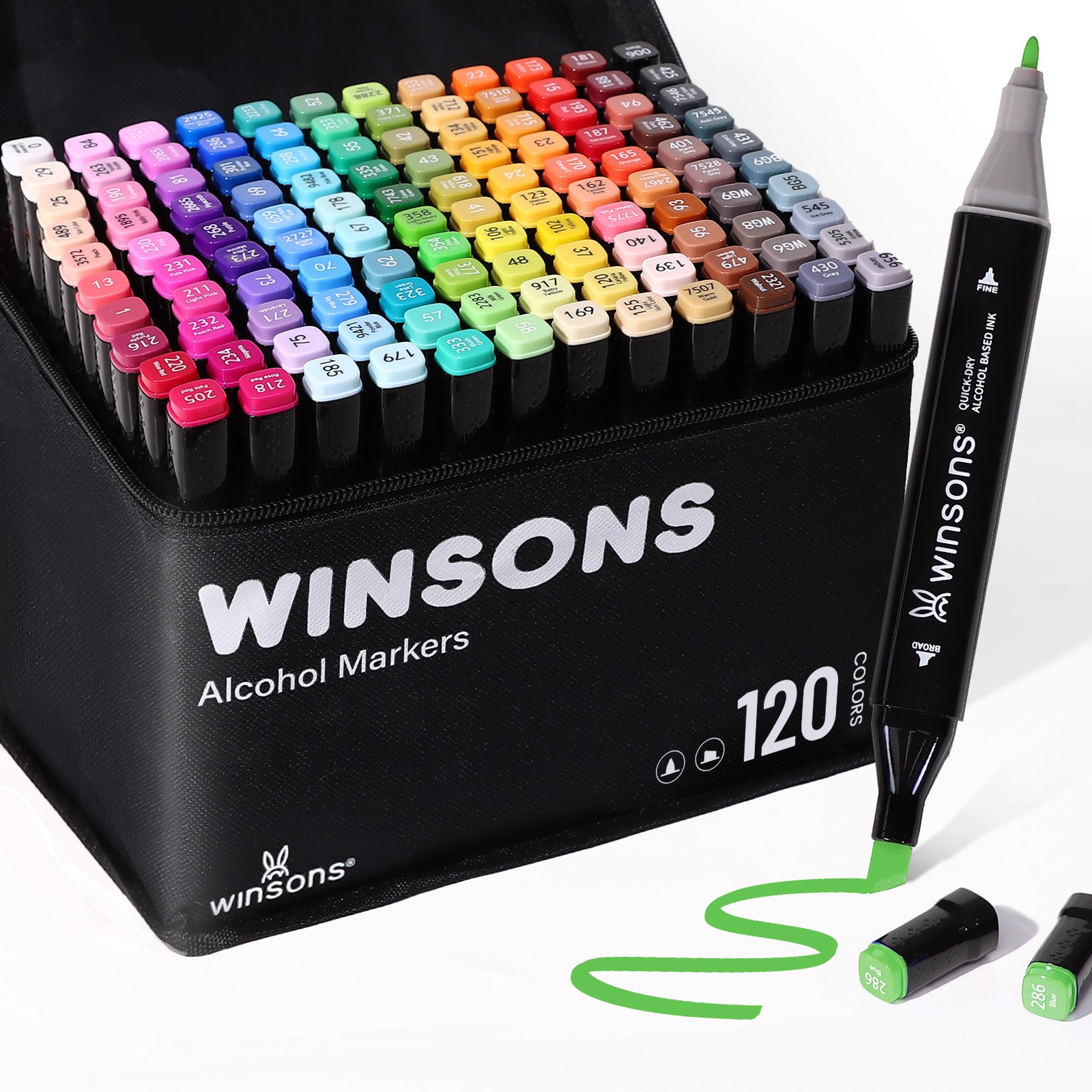
All of these colors atomize beautifully through Winsons markers, giving smooth gradients and rich saturation.
2. Different surface, different color strategies
1) Cups (ceramic / metal)
These surfaces are usually smooth and reflective, which means colors tend to:
l Look brighter than you expect
l Lose a bit of depth if they’re too dark or too strong
Best choices:
Light and mid-tone colors — pink, blue, mint, gray, light purple, etc.
These are easier to control and look great when sprayed in thin layers.

2) Models (plastic surfaces)
Model painting is all about realism, form and depth.
You want shadows, mid-tones and highlights to work together.
Best choices:
l Darker tones for shadows and deeper areas
l Mid-tones for main surfaces
l Lighter colors for edges and highlights
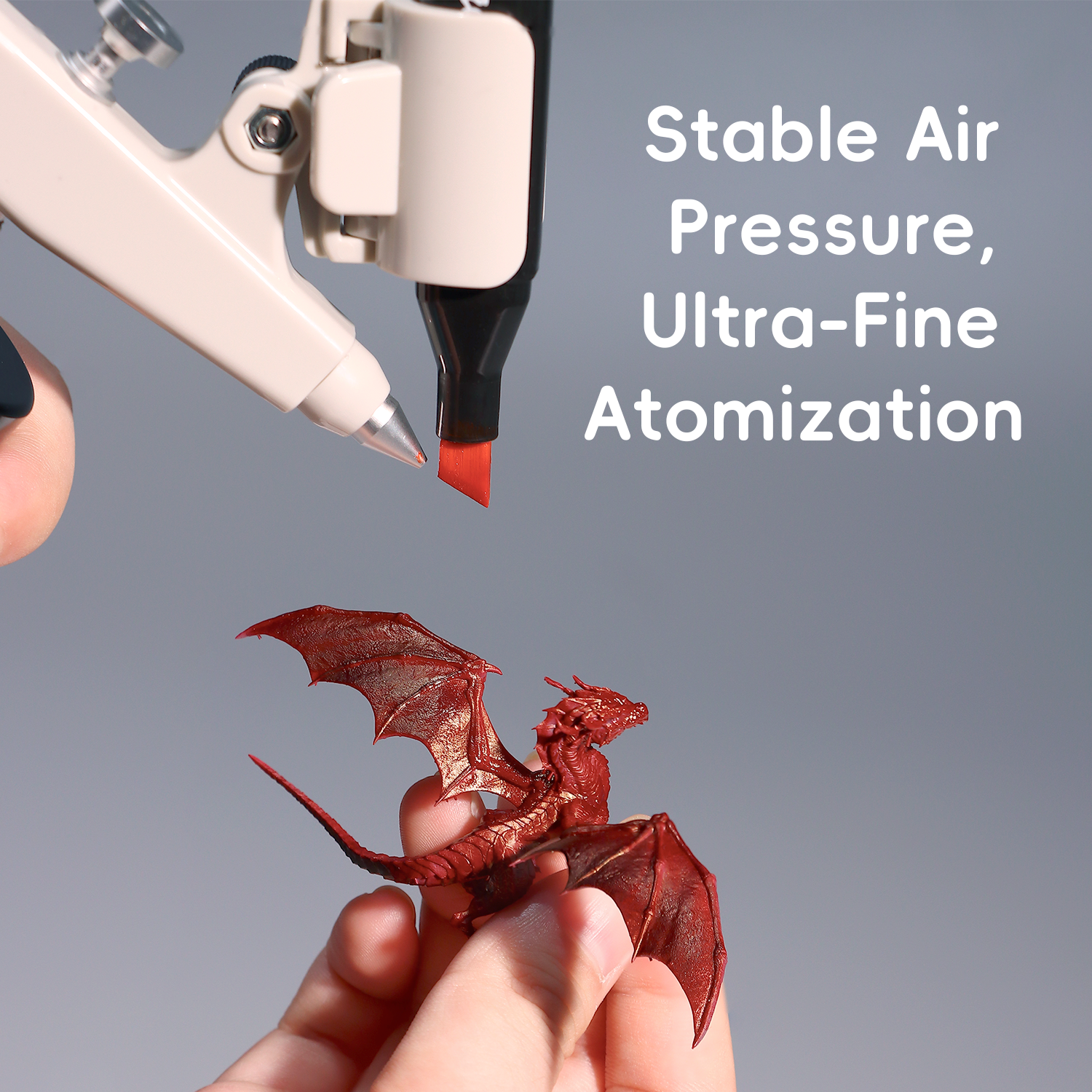
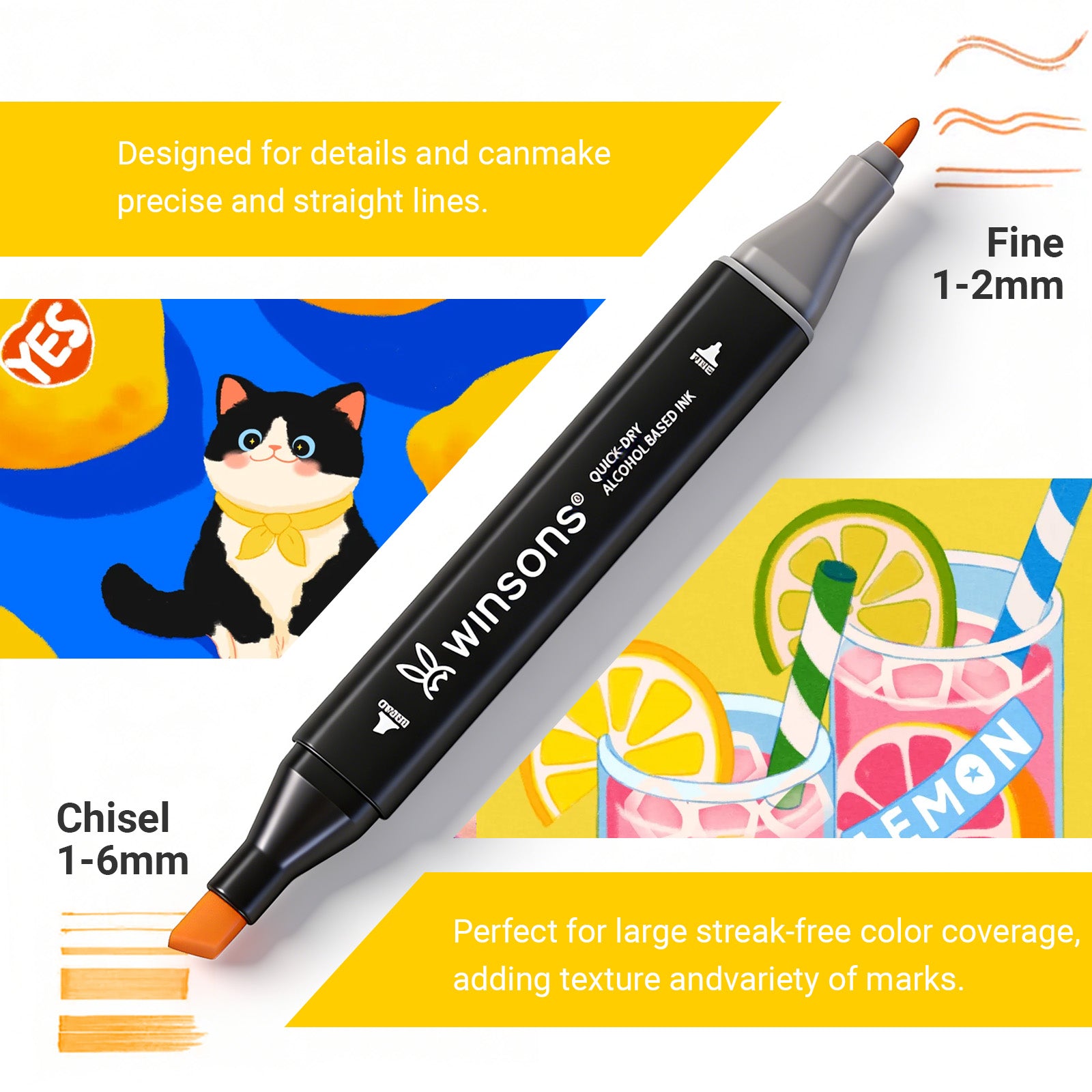
Winsons darker markers are optimized with the right tip hardness,
so they spray cleanly on small details without flooding or bleeding.

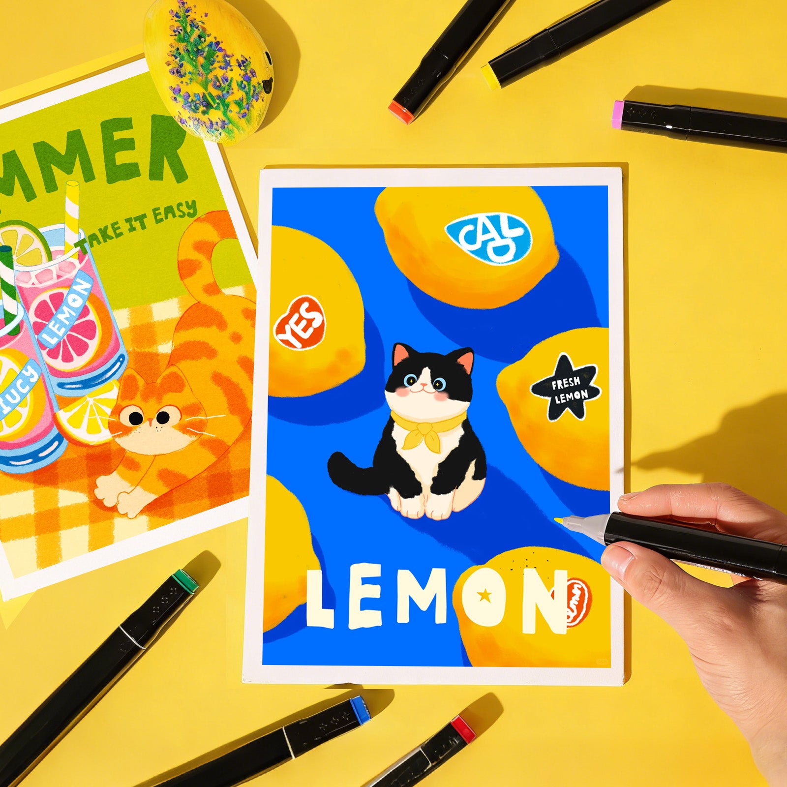
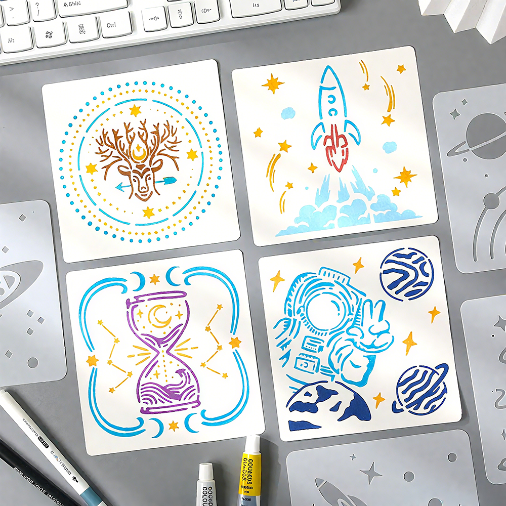
3) Illustration spraying (paper)
Paper absorbs ink, so:
l Colors appear softer and less shiny
l Gradients blend more naturally
l Overspray looks more “misty” and atmospheric
Best choices:
Same-tone gradients, for example:
l light blue → medium blue → dark blue
l warm gray → mid gray → dark gray
This is perfect for the soft, mist-like spray from Winsons airbrush systems on sketchbooks, journals, and illustration paper.

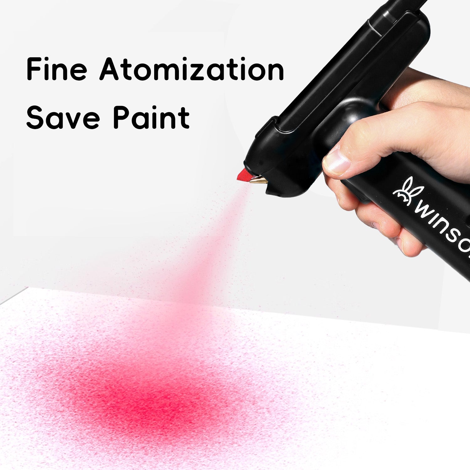
3. Choose the right “strength” of color (very important)
If you're getting inconsistent spray patterns, broken lines, or weak coverage,
often the problem is not your technique, but the ink characteristics.
|
Color Type |
Behaves Like |
Best For |
|
Light Colors |
Most fluid, easiest to spray |
Cup bases, illustration backgrounds |
|
Mid-Tones |
Stable, smooth atomization |
Model surfaces, main artwork |
|
Dark Colors |
Thicker, more likely to clog |
Model shadows, deep areas in illustrations |
Tip:
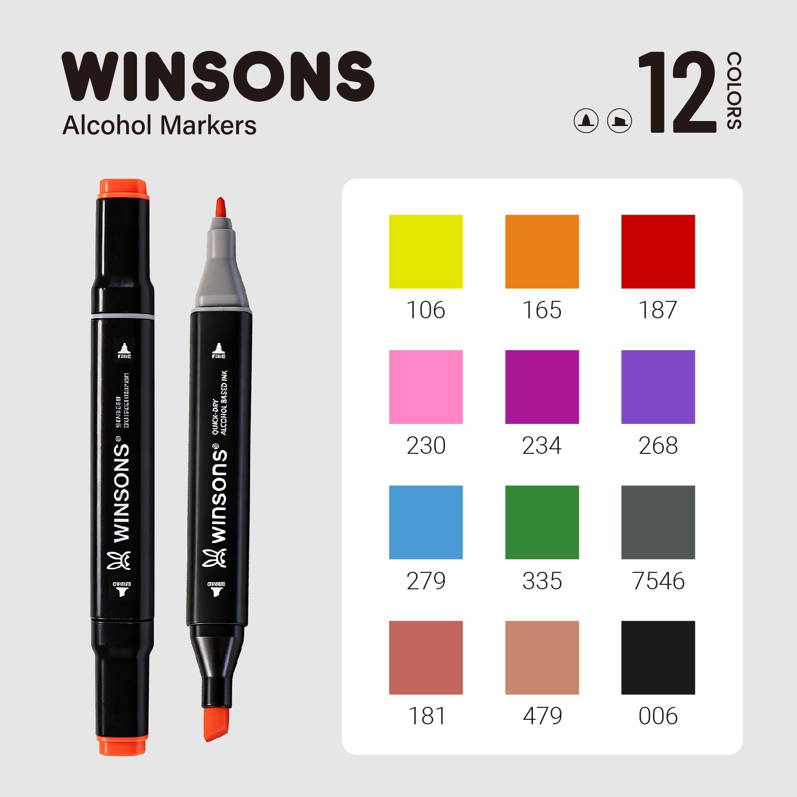
Winsons light colors (such as yellow, pink, sky blue) are especially beginner-friendly and very forgiving while you’re still getting used to airbrushing.
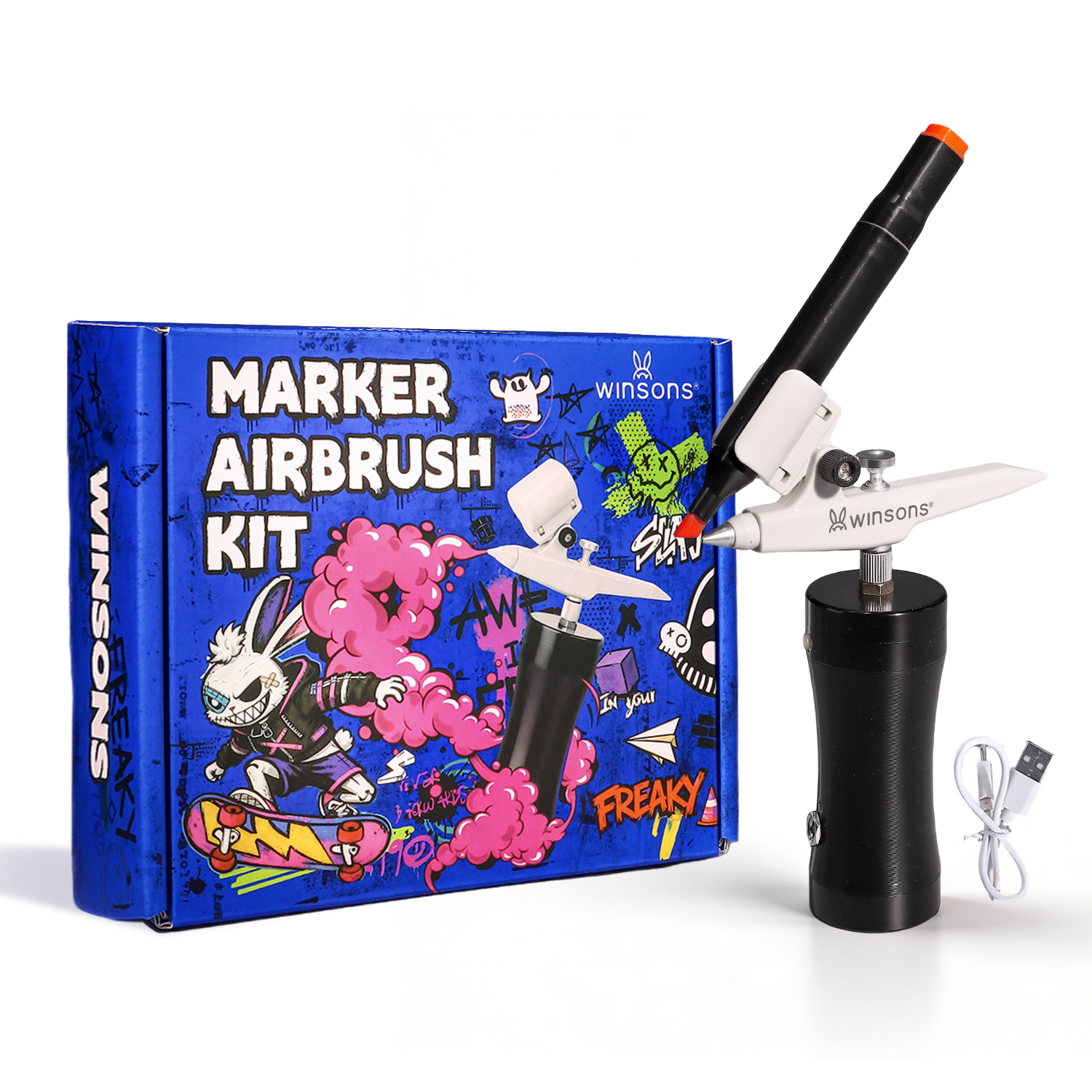
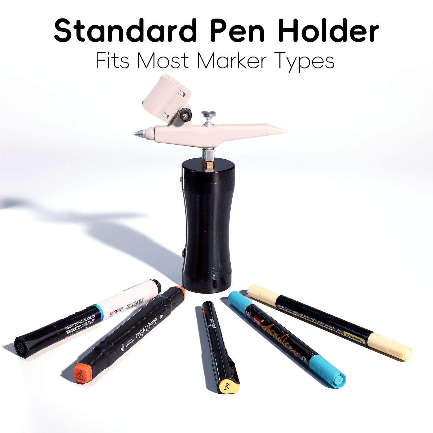
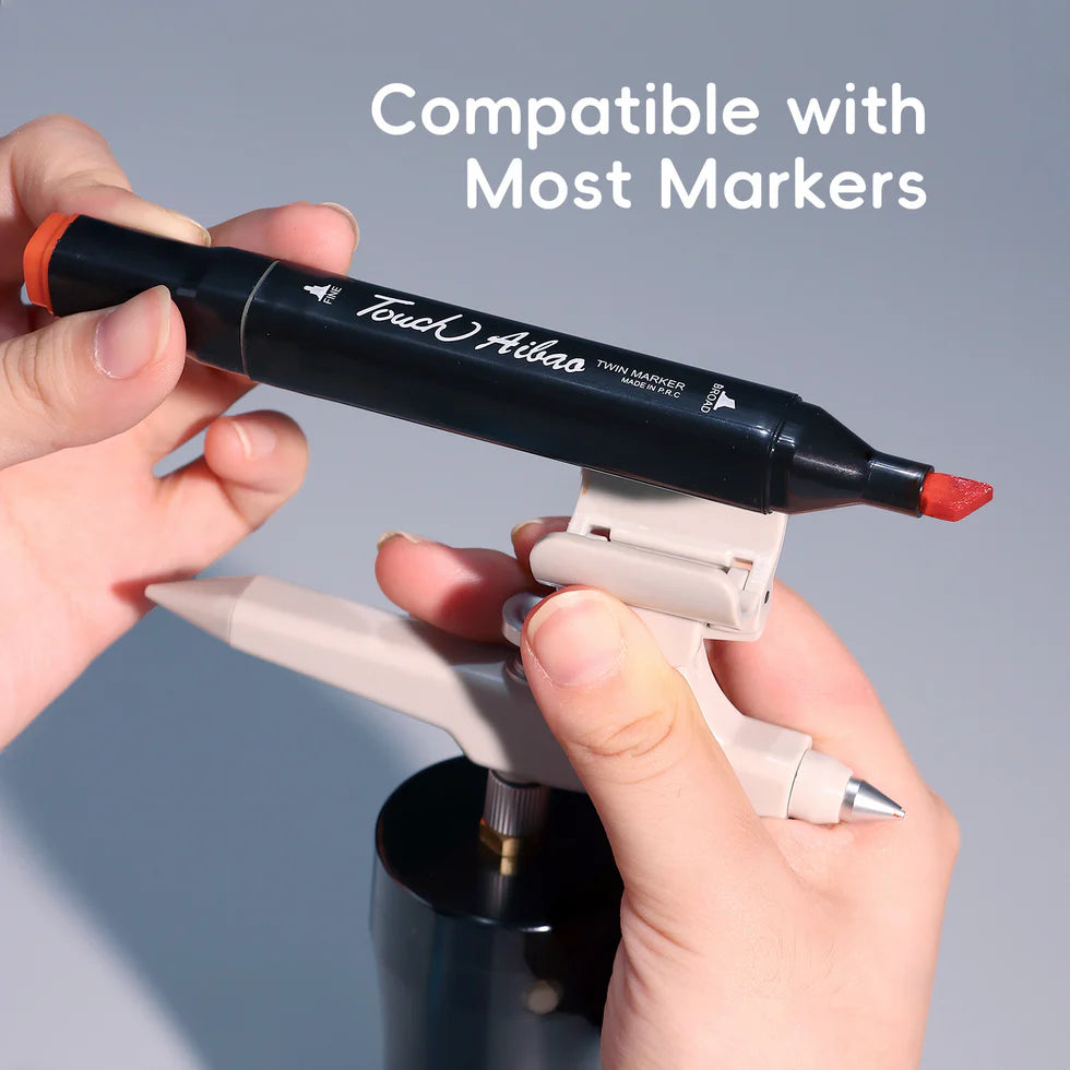
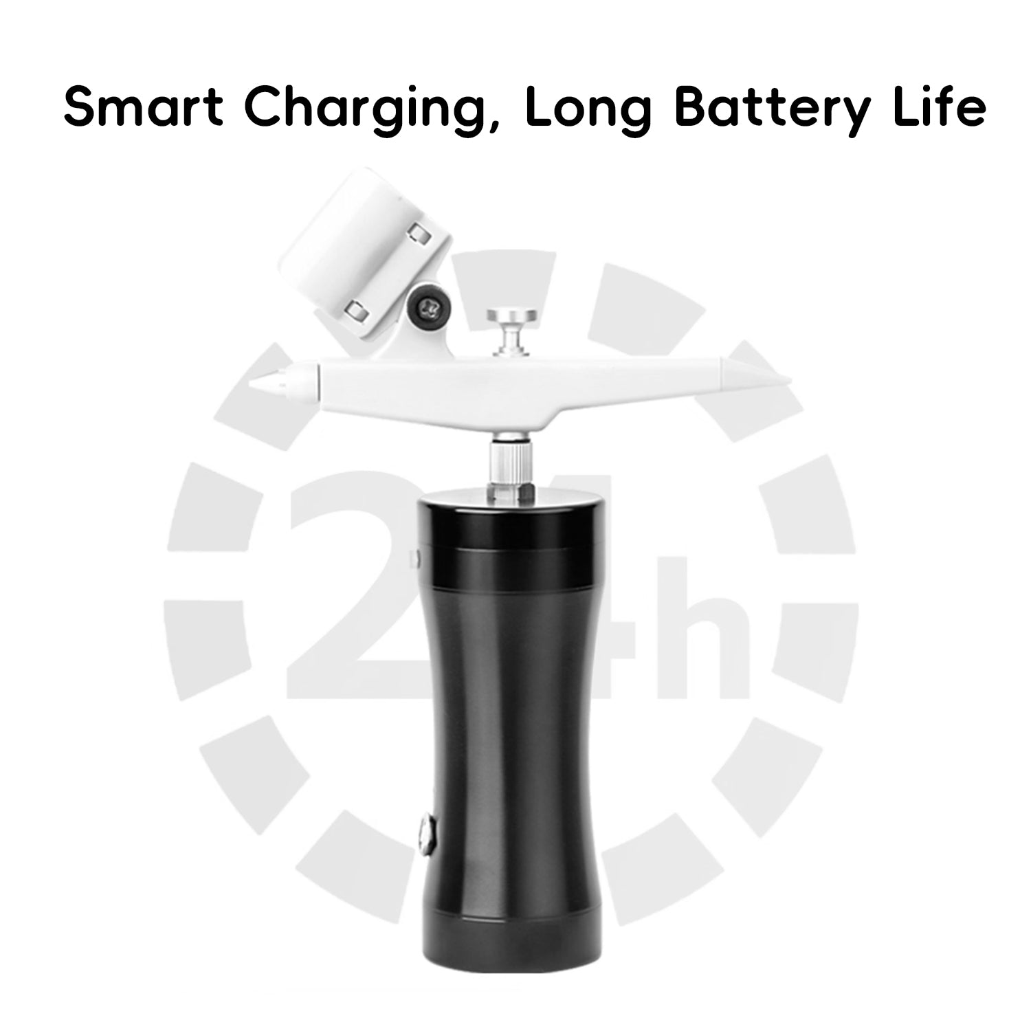
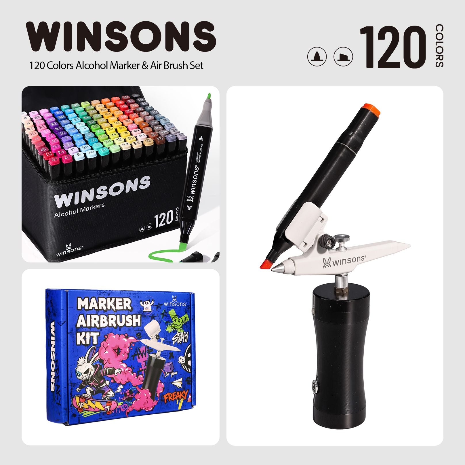
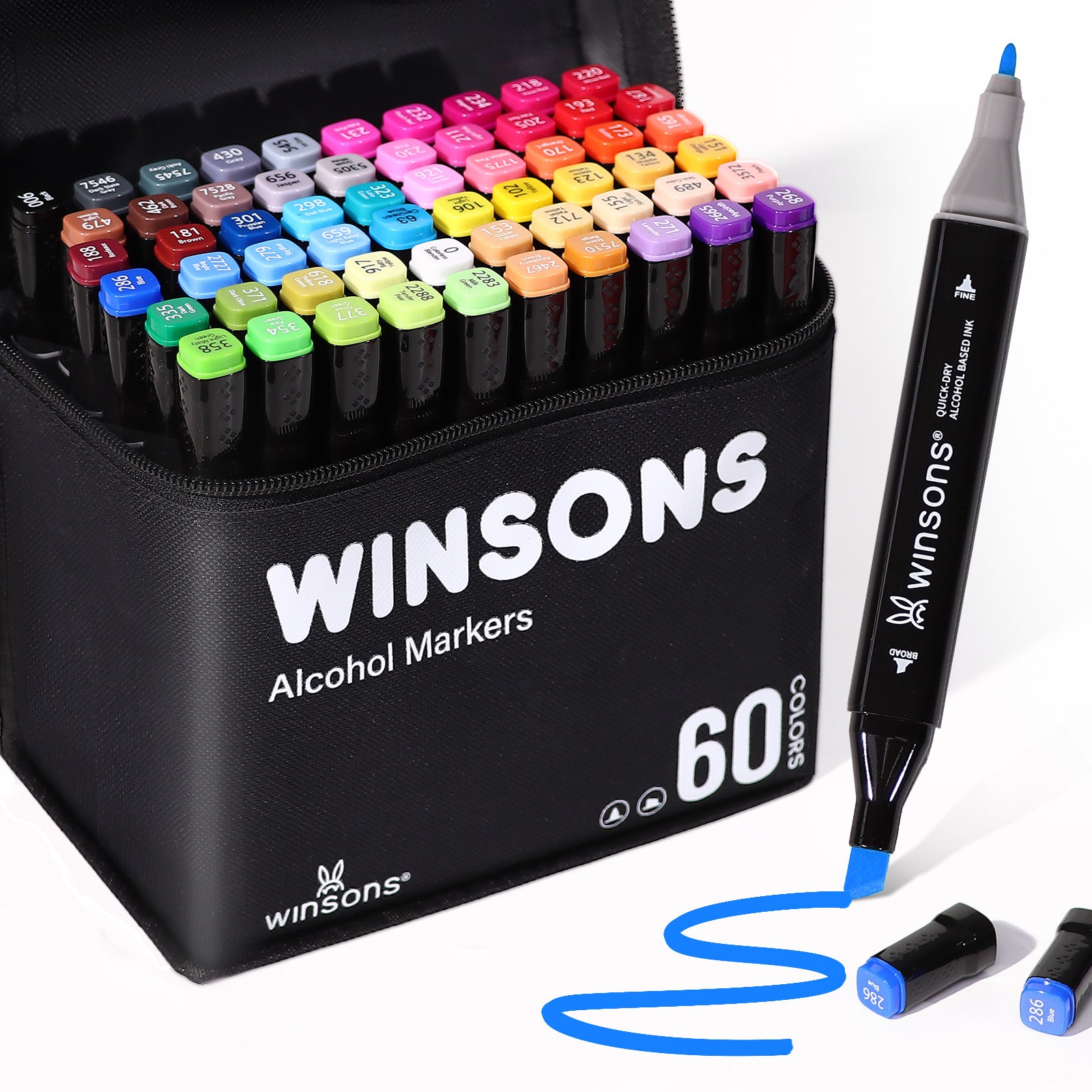
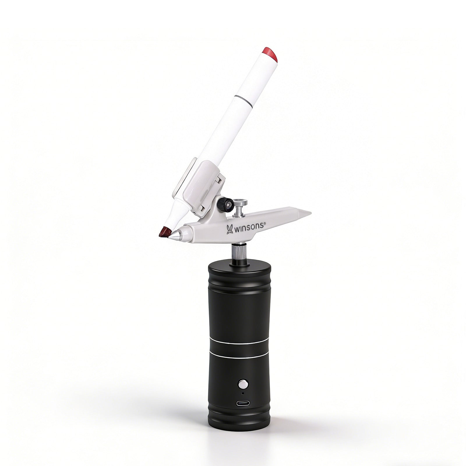
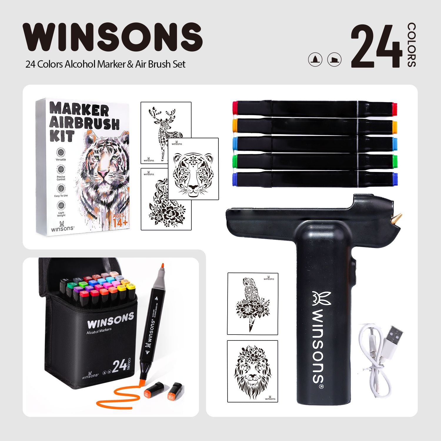
4. Why color matching is easier with Winsons Airbrush + Markers
✔ Ink formula optimized for airbrushing
✔ Marker tips designed for air-flow atomization
✔ Marker length and hardness match to the spray angle
✔ Smooth, consistent spray performance across light, mid and dark tones
✔ Tested on cups, models, illustrations, and more
The Winsons airbrush system isn’t just a tool—
it’s a simple way to turn your ideas into clean, beautiful artwork.
Whether you are decorating a gift cup, painting a character model,
or building an illustration background, you can create great color combinations with zero frustration.